Monarque Hotel
Indulgence in the pristine sea and neoclassical architecture
- Fields
Hospitality
- Scope of Work
Identity
Naming
Slogan
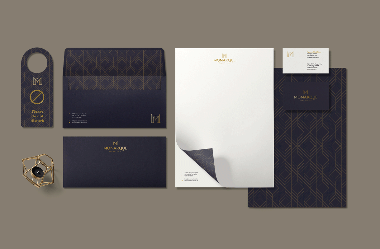
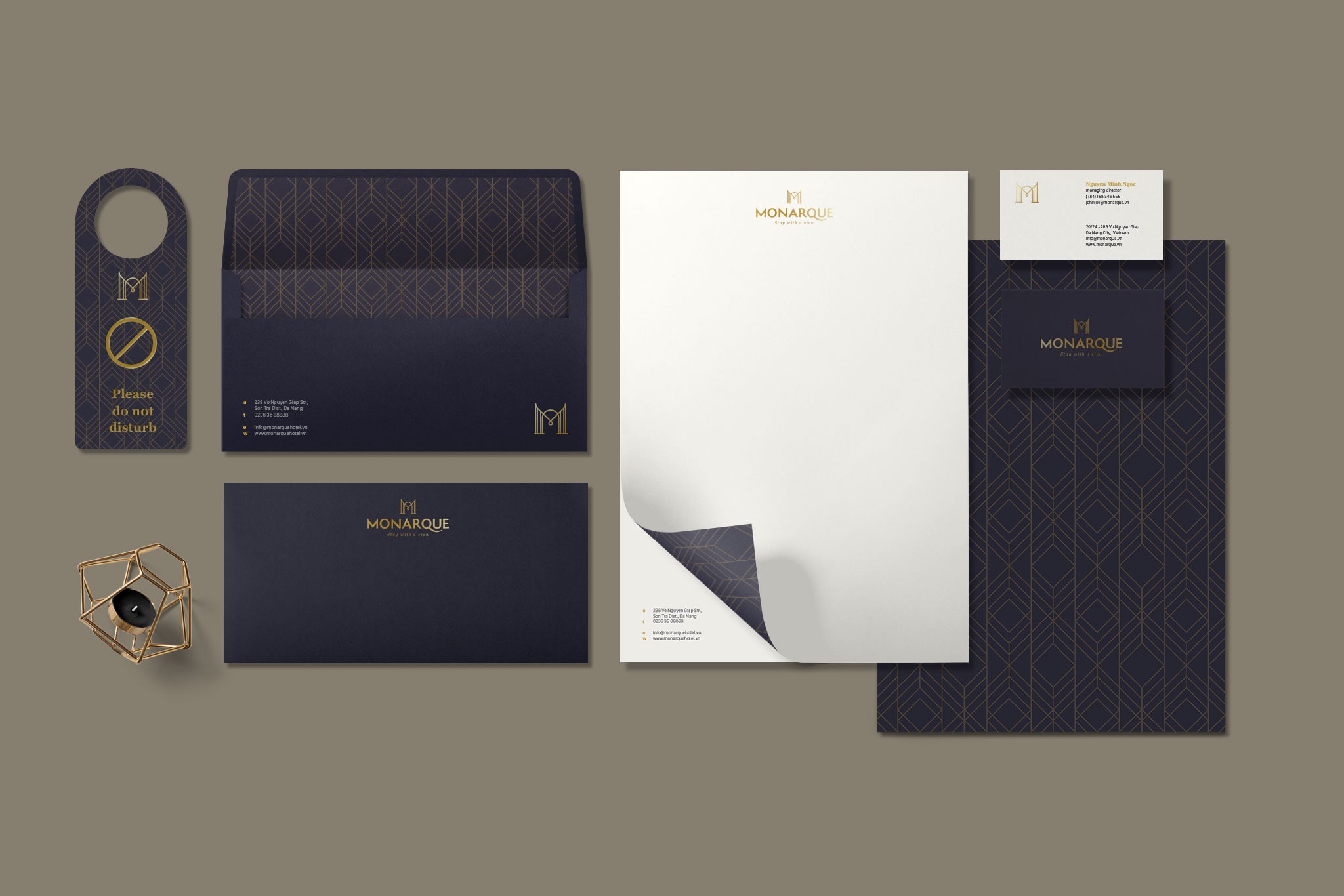
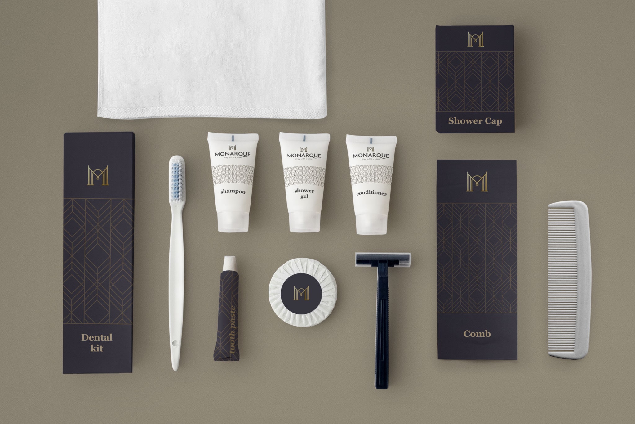
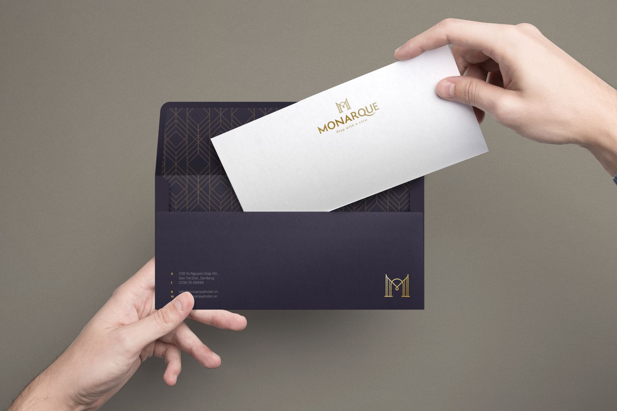
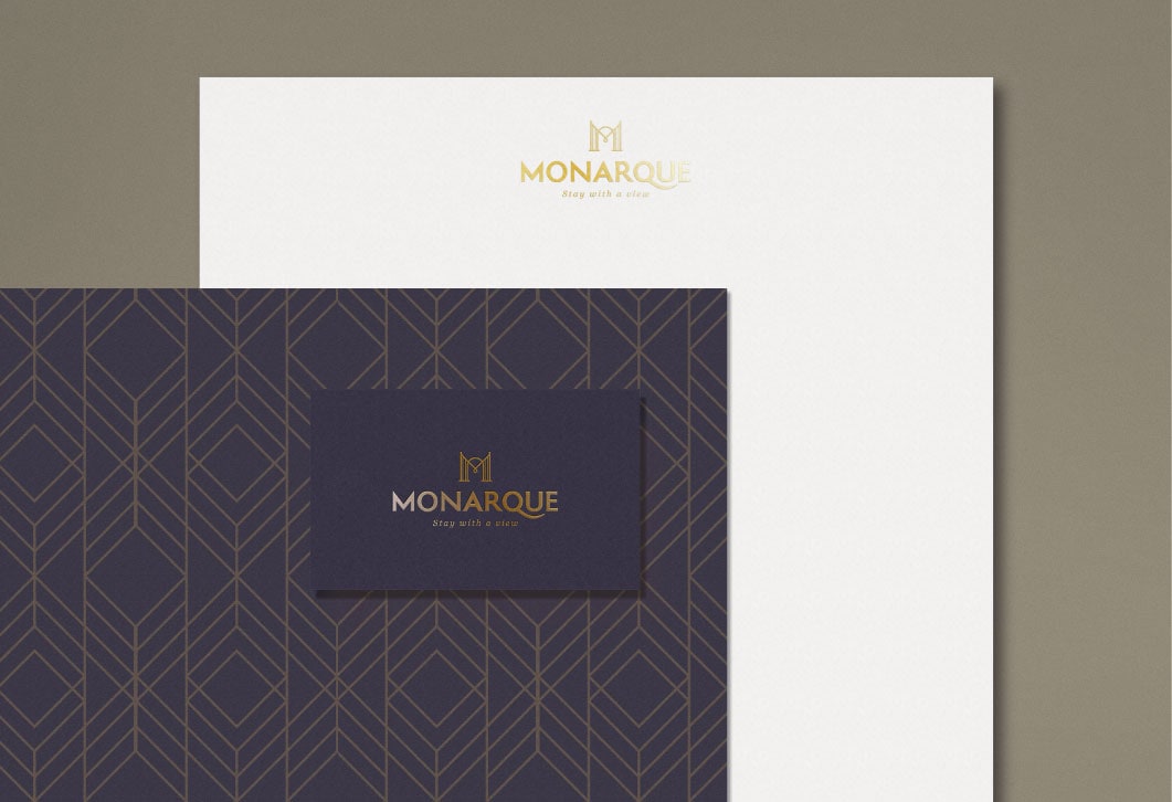
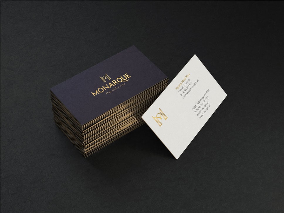
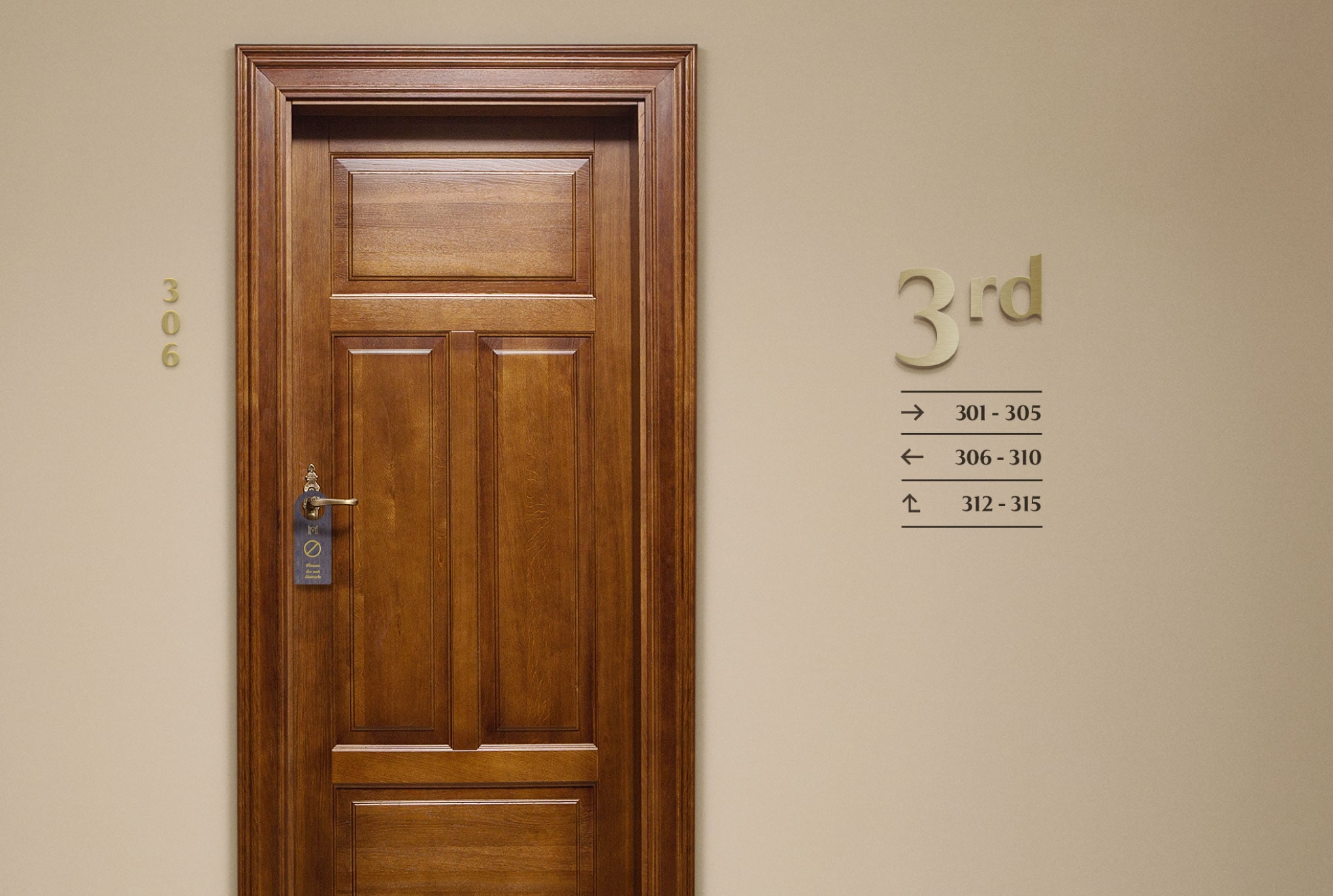
Collaterals
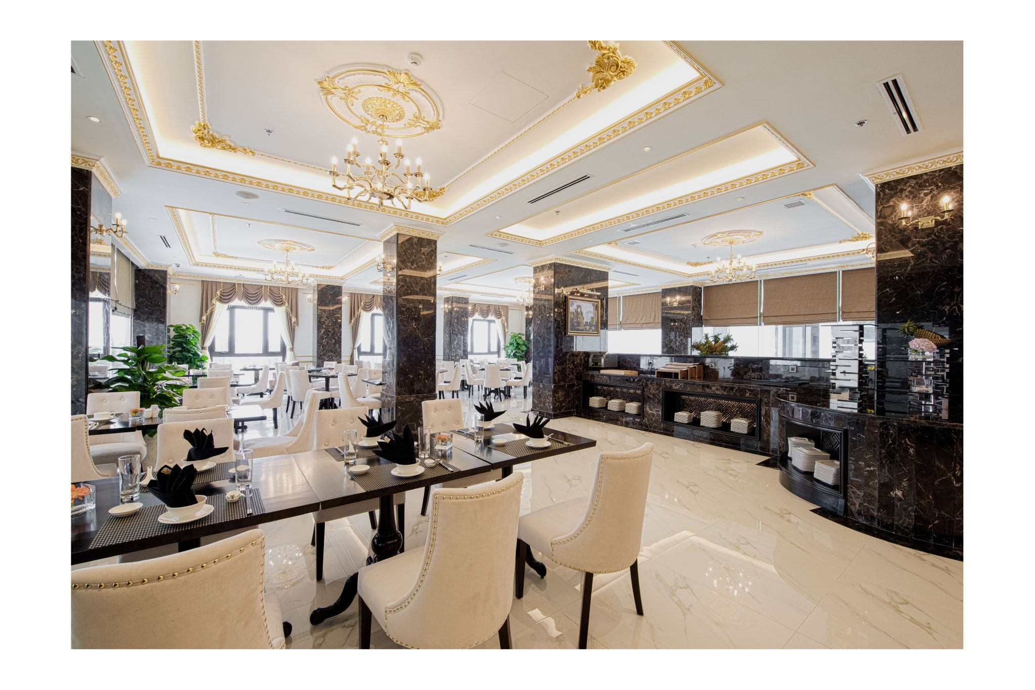
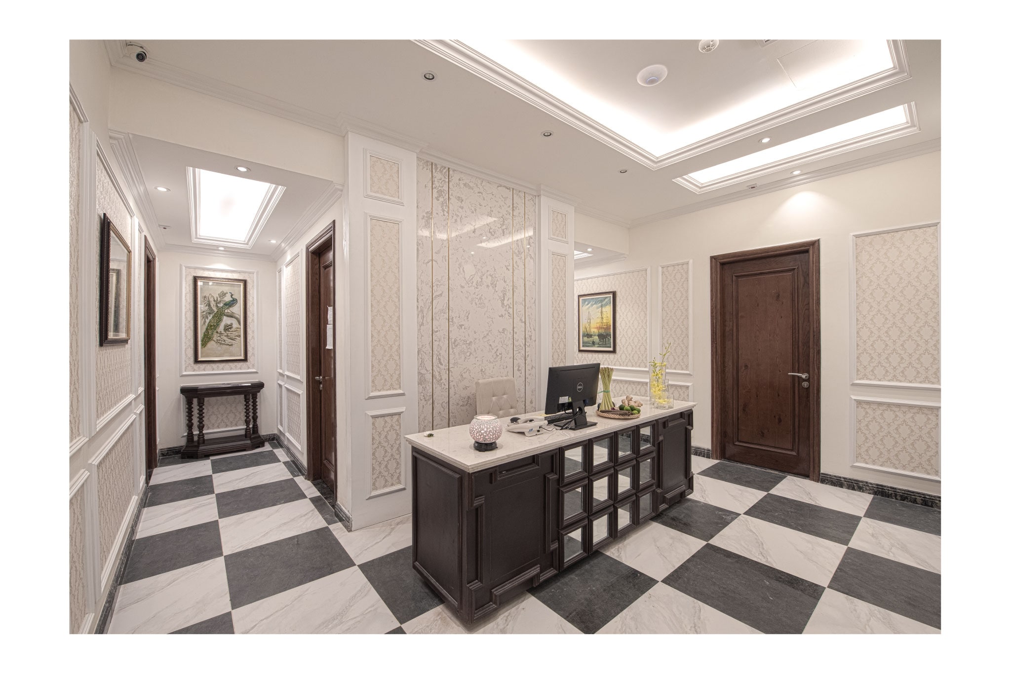
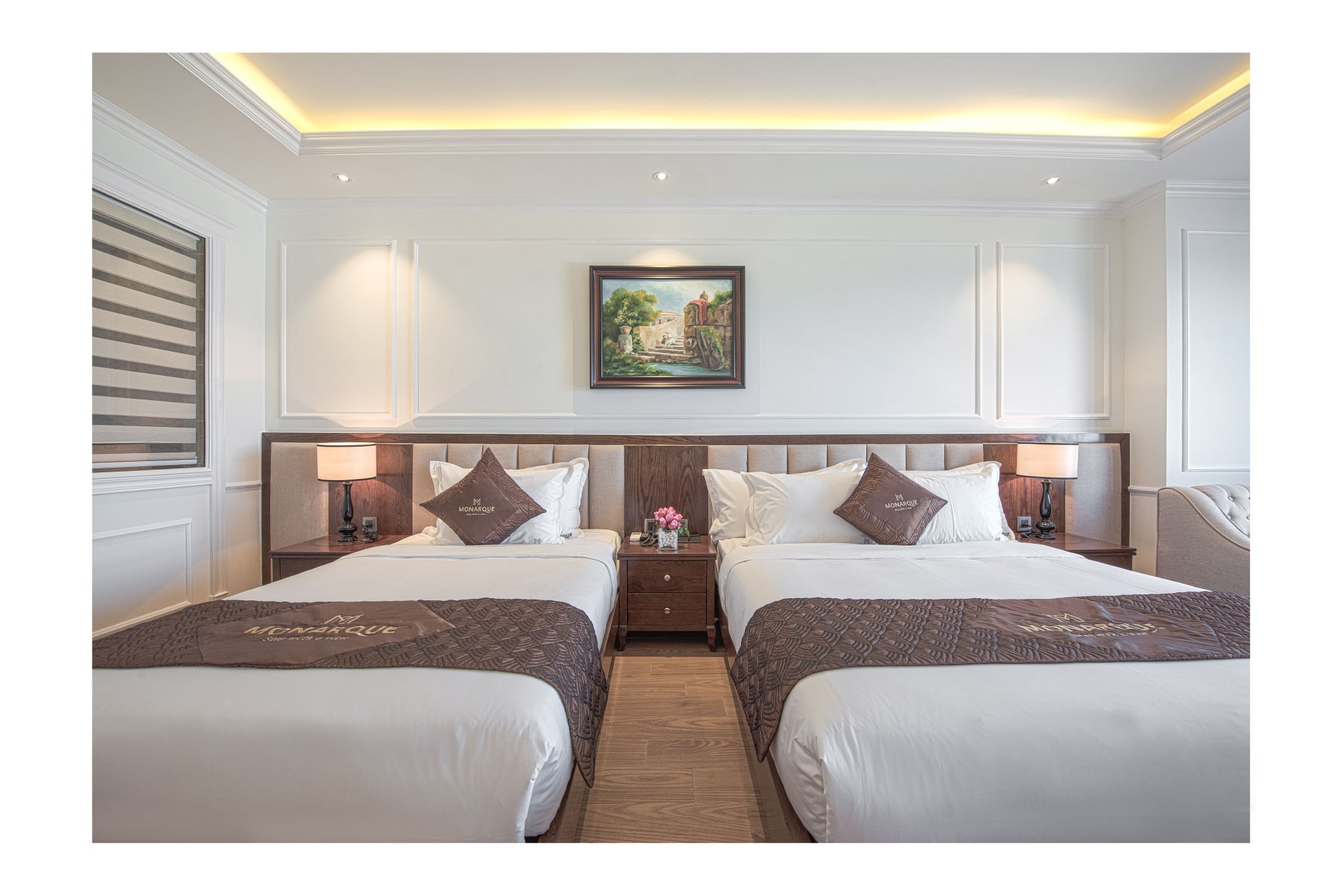
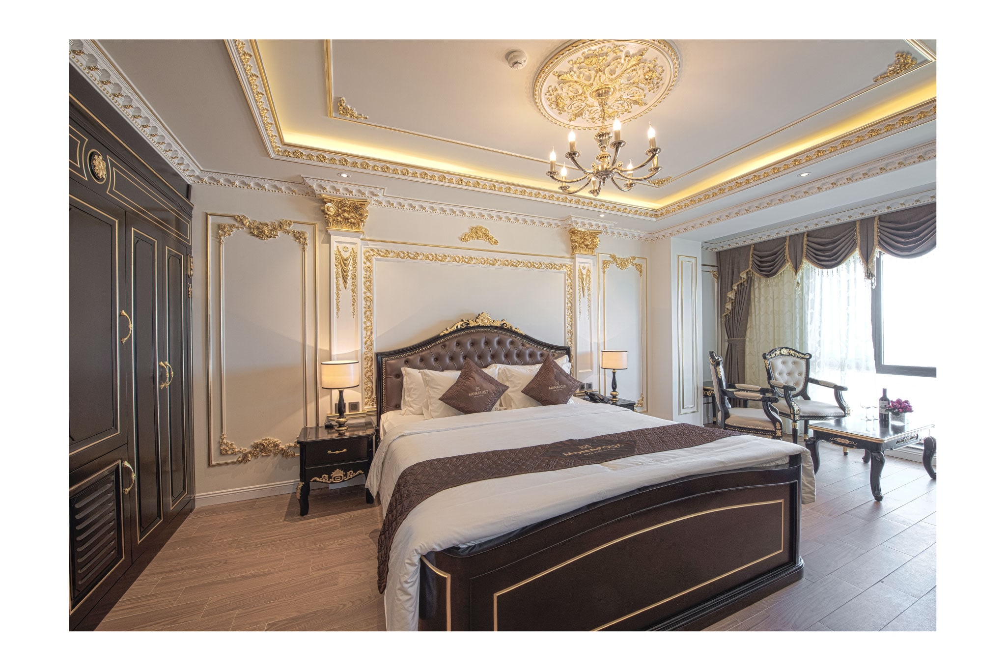
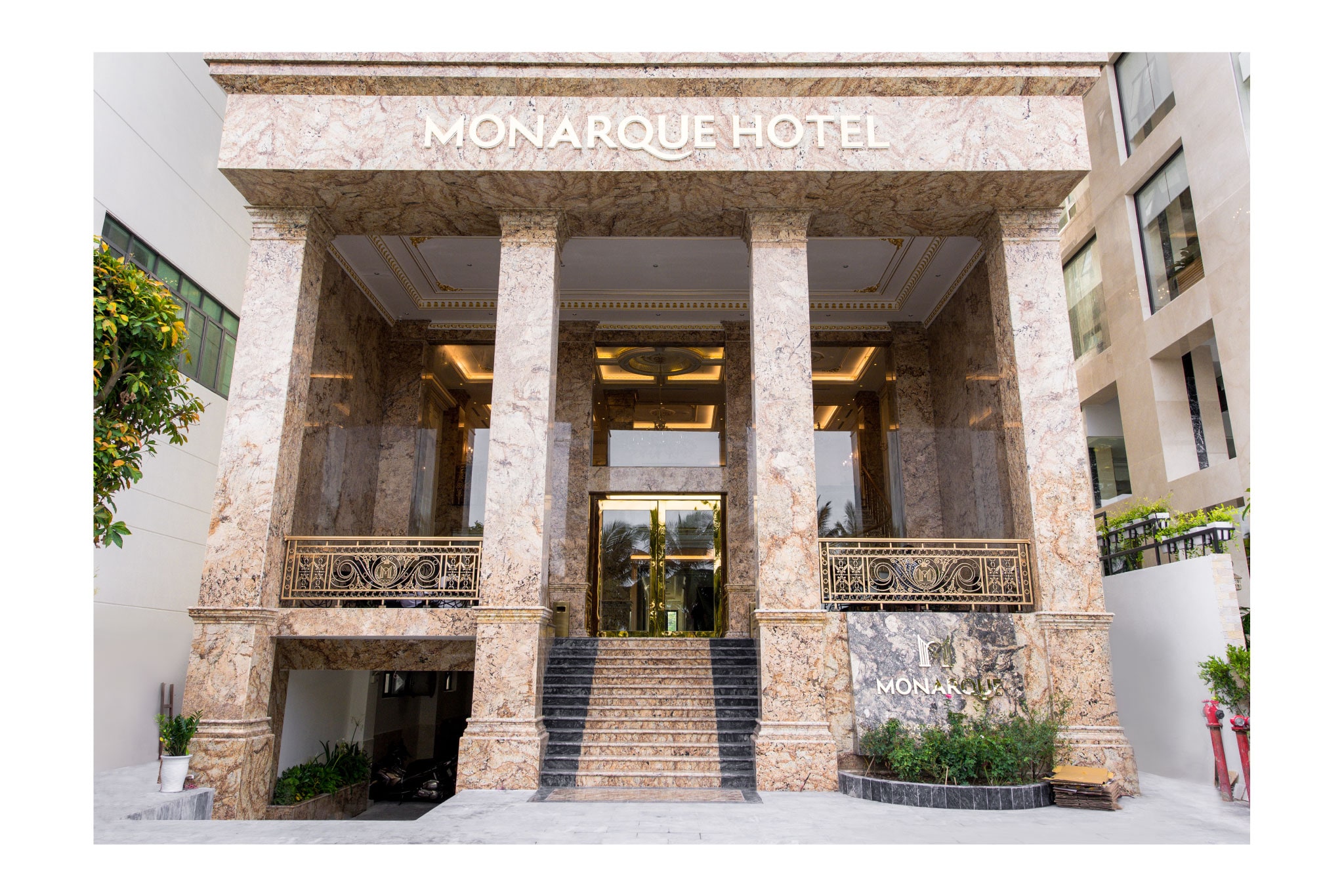
A classic touch in modern Da Nang
Monarque is a new hotel in the coastal Danang. Monarque Hotel is designed in neoclassical French architecture but it is not too ostentatious.
The brand identity of the hotel must show the core features include good location with sea view, neoclassical architecture, luxury, sophistication and depth. In addition, the brand must target both domestic and foreign customers.
Stay with a view
Slogan "Stay with a view" shows the position advantage of the hotel. In terms of phonetics, the slogan is short, simple and easy to understand for both local people and abroad tourist. Other brand personalities are expressed through the logo while its architecture is the inspiration of the logo design. The icon of the logo uses lines that captures the neo-classical feeling. Slim lines are connected to intelligently to create the feeling of sophistication as the spirit of the hotel.
A spirit of subtle deluxe
The letter “M” is symbolized as an open, luxurious gateway. This design speaks out the character of a deluxe hotel that is subtle but accessible at a reasonable cost. About typography, we use classic and bold fonts that emphasize classicism of the brand. The tail of Q letter is stylized as a wave getting harmony with the bowl of U letter to demonstrate the metaphor of the hotel sea-front location. Typeface contrasts with the name of the hotel. The brand positioning phrase uses sans serif font that provides a modern look in a classic whole.
Monarque has a complete look to conquer the domestic and foreign tourists in Vietnam's most livable city.